ShopDreamUp AI ArtDreamUp

Deviation Actions


![[ProgressingArtistry] - Yukihira Soma](https://images-wixmp-ed30a86b8c4ca887773594c2.wixmp.com/f/60e3d4fa-11bd-4974-83bb-c54ffdda5fa7/d9mbh2t-7847044a-5aee-4f41-8e8a-e819be27e524.png/v1/crop/w_92,h_92,x_0,y_1,scl_0.036421219319082,q_70,strp/_progressingartistry____yukihira_soma_by_progressingartistry_d9mbh2t-92s.jpg?token=eyJ0eXAiOiJKV1QiLCJhbGciOiJIUzI1NiJ9.eyJzdWIiOiJ1cm46YXBwOjdlMGQxODg5ODIyNjQzNzNhNWYwZDQxNWVhMGQyNmUwIiwiaXNzIjoidXJuOmFwcDo3ZTBkMTg4OTgyMjY0MzczYTVmMGQ0MTVlYTBkMjZlMCIsIm9iaiI6W1t7InBhdGgiOiJcL2ZcLzYwZTNkNGZhLTExYmQtNDk3NC04M2JiLWM1NGZmZGRhNWZhN1wvZDltYmgydC03ODQ3MDQ0YS01YWVlLTRmNDEtOGU4YS1lODE5YmUyN2U1MjQucG5nIiwiaGVpZ2h0IjoiPD0xNjUyIiwid2lkdGgiOiI8PTE2MDAifV1dLCJhdWQiOlsidXJuOnNlcnZpY2U6aW1hZ2Uud2F0ZXJtYXJrIl0sIndtayI6eyJwYXRoIjoiXC93bVwvNjBlM2Q0ZmEtMTFiZC00OTc0LTgzYmItYzU0ZmZkZGE1ZmE3XC9wcm9ncmVzc2luZ2FydGlzdHJ5LTQucG5nIiwib3BhY2l0eSI6OTUsInByb3BvcnRpb25zIjowLjQ1LCJncmF2aXR5IjoiY2VudGVyIn19.mzjdgXG802nnFztaDBUxNu4wu8L8W9U_4Wi0ZhNA6Wg)


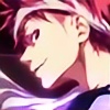
![[Waifu Headshots #2] Ruby](https://images-wixmp-ed30a86b8c4ca887773594c2.wixmp.com/f/ecfc35bb-971c-4b39-ac8c-1d83c6570d75/dcgj2to-8a5bafaf-9437-4477-8bdd-1337d2fac1b6.png/v1/crop/w_184,h_184,x_18,y_0,scl_0.15672913117547,q_70,strp/_waifu_headshots__2__ruby_by_burningtiger9000_dcgj2to-92s-2x.jpg?token=eyJ0eXAiOiJKV1QiLCJhbGciOiJIUzI1NiJ9.eyJzdWIiOiJ1cm46YXBwOjdlMGQxODg5ODIyNjQzNzNhNWYwZDQxNWVhMGQyNmUwIiwiaXNzIjoidXJuOmFwcDo3ZTBkMTg4OTgyMjY0MzczYTVmMGQ0MTVlYTBkMjZlMCIsIm9iaiI6W1t7ImhlaWdodCI6Ijw9NzM5IiwicGF0aCI6IlwvZlwvZWNmYzM1YmItOTcxYy00YjM5LWFjOGMtMWQ4M2M2NTcwZDc1XC9kY2dqMnRvLThhNWJhZmFmLTk0MzctNDQ3Ny04YmRkLTEzMzdkMmZhYzFiNi5wbmciLCJ3aWR0aCI6Ijw9MTAyNCJ9XV0sImF1ZCI6WyJ1cm46c2VydmljZTppbWFnZS5vcGVyYXRpb25zIl19.klI-9R1ATly38KCyinPiIphRz8onn0Qu5l2uAQPoKmw)
![[Waifu Headshots #2] Ruby](https://images-wixmp-ed30a86b8c4ca887773594c2.wixmp.com/f/ecfc35bb-971c-4b39-ac8c-1d83c6570d75/dcgj2to-8a5bafaf-9437-4477-8bdd-1337d2fac1b6.png/v1/crop/w_92,h_92,x_9,y_0,scl_0.078364565587734,q_70,strp/_waifu_headshots__2__ruby_by_burningtiger9000_dcgj2to-92s.jpg?token=eyJ0eXAiOiJKV1QiLCJhbGciOiJIUzI1NiJ9.eyJzdWIiOiJ1cm46YXBwOjdlMGQxODg5ODIyNjQzNzNhNWYwZDQxNWVhMGQyNmUwIiwiaXNzIjoidXJuOmFwcDo3ZTBkMTg4OTgyMjY0MzczYTVmMGQ0MTVlYTBkMjZlMCIsIm9iaiI6W1t7ImhlaWdodCI6Ijw9NzM5IiwicGF0aCI6IlwvZlwvZWNmYzM1YmItOTcxYy00YjM5LWFjOGMtMWQ4M2M2NTcwZDc1XC9kY2dqMnRvLThhNWJhZmFmLTk0MzctNDQ3Ny04YmRkLTEzMzdkMmZhYzFiNi5wbmciLCJ3aWR0aCI6Ijw9MTAyNCJ9XV0sImF1ZCI6WyJ1cm46c2VydmljZTppbWFnZS5vcGVyYXRpb25zIl19.klI-9R1ATly38KCyinPiIphRz8onn0Qu5l2uAQPoKmw)


Description
Hello there! Just trying some new styles out! Shout outs to Sam-Baten for teaching me few tricks on Photoshop xD!
This deviation was done in 1hour and 15mins. The Line works were done in Paint tool SAI and the colors are in Photoshop. I WOULD REALLY APPRECIATE IT IF YOU LEAVE lilFeedbacks. This is a milestone for me. I'm about to try new styles so stay tuned for my next deviations. Thanks for reading!.
This deviation was done in 1hour and 15mins. The Line works were done in Paint tool SAI and the colors are in Photoshop. I WOULD REALLY APPRECIATE IT IF YOU LEAVE lilFeedbacks. This is a milestone for me. I'm about to try new styles so stay tuned for my next deviations. Thanks for reading!.
Image size
2000x2000px 1.5 MB
© 2016 - 2024 ProgressingArtistry
Comments21
Join the community to add your comment. Already a deviant? Log In
Hello, I'm commenting for  .
. 
First of all, I think you did a fine job with the lineart. It's very clean and has an overall nice look with some variance and all. It looks especially good in the upper part of the face, it really brings out the eyes and conveys a strong expression. Very nice.
Secondly, I like your color palette. The deep reds of her hair are in nice contrast with her pale skin and the gray eyes. I also think that the pitch black lines work well in this context, even though I usually prefer colored lineart. I also love the way you shaded her eyes, it's very pretty.
Now, for some things that could be a bit better:
I can see that you layered the hair a bit and that's a very good start, since hair is three-dimensional. Unfortunately, there are a lot of other things that could need some improvement here. I can see that you used a special brush for the hair and while such brushes can be a great way to save time there are also times when they're not the best choice. I see two main problems in this case. The first one is that the way you colored the hair clashes with the style you used for the rest of the picture. The hair is very detailed and has strong contrast, while the skin has almost no detail and is shaded in a much different way. Also, the contour is much less detailed than the strands within, which makes it look a bit like a cutout glued on top of the head. The second issue I have with it is that the strands don't flow in a way that looks natural. This is why I mentioned the brush earlier, you can clearly see the single strokes which the strands follow perfectly until they end rather aprubtly. In reality single strands never look like this - while they usually have a direction in which they flow, they also bend in different directions and vary a lot in length. Even perfectly straight hair has some irregularities.
I hope this was of some help for you. Have fun with your future style experiments, they're always a great way to learn. (Smile)")
. First of all, I think you did a fine job with the lineart. It's very clean and has an overall nice look with some variance and all. It looks especially good in the upper part of the face, it really brings out the eyes and conveys a strong expression. Very nice.
Secondly, I like your color palette. The deep reds of her hair are in nice contrast with her pale skin and the gray eyes. I also think that the pitch black lines work well in this context, even though I usually prefer colored lineart. I also love the way you shaded her eyes, it's very pretty.
Now, for some things that could be a bit better:
I can see that you layered the hair a bit and that's a very good start, since hair is three-dimensional. Unfortunately, there are a lot of other things that could need some improvement here. I can see that you used a special brush for the hair and while such brushes can be a great way to save time there are also times when they're not the best choice. I see two main problems in this case. The first one is that the way you colored the hair clashes with the style you used for the rest of the picture. The hair is very detailed and has strong contrast, while the skin has almost no detail and is shaded in a much different way. Also, the contour is much less detailed than the strands within, which makes it look a bit like a cutout glued on top of the head. The second issue I have with it is that the strands don't flow in a way that looks natural. This is why I mentioned the brush earlier, you can clearly see the single strokes which the strands follow perfectly until they end rather aprubtly. In reality single strands never look like this - while they usually have a direction in which they flow, they also bend in different directions and vary a lot in length. Even perfectly straight hair has some irregularities.
I hope this was of some help for you. Have fun with your future style experiments, they're always a great way to learn.